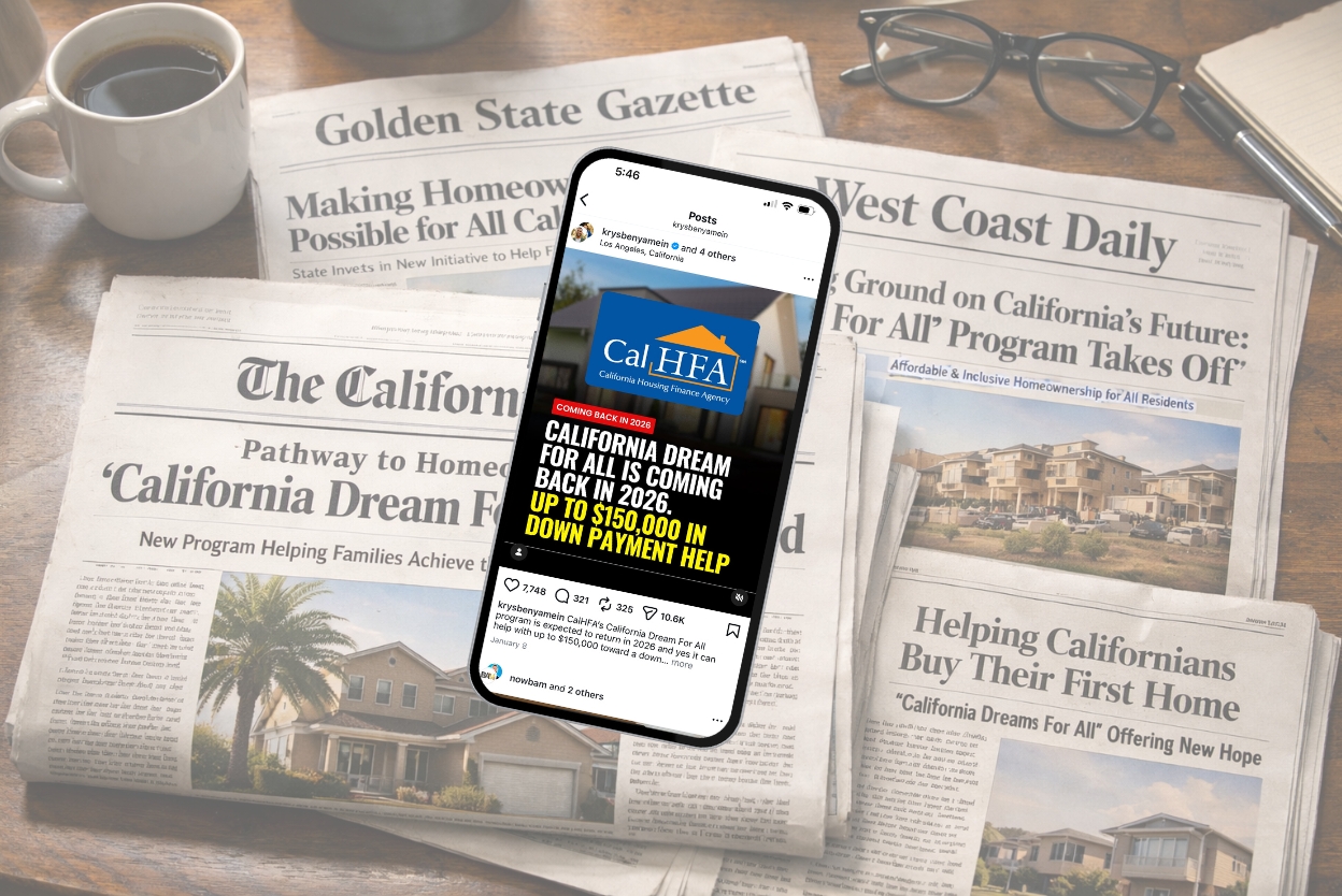
Last week, I posted a single image.
No video. No carousel. No talking head. No editing spiral that eats your afternoon.
Just one headline-style graphic.
Here’s what that one post produced:
- 400,999 views
- 10,467 shares
- 2,997 saves
- 30+ buyer phone numbers and counting
- 97.6% of views from non-followers
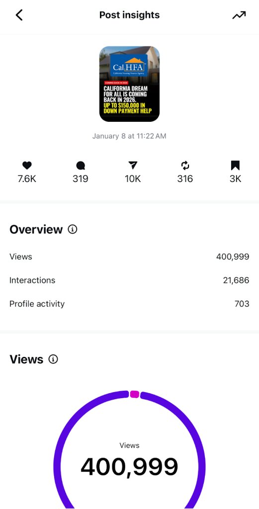
That last number is the one that matters most. It means the post didn’t just perform inside my existing audience. It traveled. It put my brand in front of new people.
Here’s why I’m sharing this with you: a post like this takes a fraction of the time compared to video, and it can still generate serious inbound leads.
If you’re an agent trying to get more results without turning your entire life into content creation, this format is worth testing.
Why I think it worked (and what I would repeat)
I can’t prove exactly which ingredient caused the spike, but I know what was present in the post and what I would absolutely do again:
- It borrowed authority. The graphic used a recognizable program and official-looking style. That matters because people trust what feels established. Familiar branding lowers skepticism.
- It used a specific, meaningful number. “Up to $150,000” isn’t vague. It’s concrete. Numbers like that stop the scroll because they immediately answer the question, “Is this worth my attention?”
- It created zero friction. One slide. One message. Instant clarity. There was nothing to decode and nothing to swipe through.
- I kept the branding light. There’s nothing wrong with putting your face, your logo, or your handle on content. But every branding element comes with a tradeoff. The more a post feels like someone else’s marketing, the less likely people are to repost it.
This post felt like news and information, not an ad. That’s a critical distinction if the goal is shares.
Shareability Is a Design Choice
One thing most agents underestimate is shareability design.
If you want a post to travel, ask yourself whether someone would feel comfortable reposting it to their Story without explanation. The posts that perform best usually feel like:
- A headline
- A public update
- Something genuinely useful
They don’t feel like brand pieces.
I’ve tested this headline-style format on other topics too.
A 401(k) down payment headline pulled 9,095 views with 103 shares and 26 saves. And 97.6% of the audience was non-followers.
A California rental rules post reached 16,859 views with 94 shares and 58 saves. The audience for this one was a more even mix: 41.9% followers and 58.1% non-followers.
Neither went nuclear, but both confirmed the same thing. People share clear headlines.
They also taught me something else: why the rental rules post underperformed (what I would fix). I think the rental rules post had a couple of mistakes that hurt it:
- “Swipe to discover” killed the headline feel. It turned it into a teaser instead of a clean headline.
- Too much branding on the bottom. It had my handle and another handle.
Again, nothing wrong with branding, but you have to understand the tradeoff.
More branding usually means fewer reposts.
How Attention Turned Into Phone Numbers
This post didn’t include a hard CTA. Most of the leads came from comments and DMs asking simple questions:
- How do I qualify?
- Can you send me info?
- Is this real?l
Instead of overexplaining, I used a short, repeatable reply to move the conversation forward.
Here’s the exact DM script I used:
“Happy to explain, it’s way easier to walk through live than over text.What’s the best number to reach you for a quick 3 to 5 minute call?”
That’s it. No paragraphs. No info dump. Just a clear next step.
Where the Real Leverage Comes From
The mistake most people make is treating a high-performing post like this as a win by itself.
The win comes from what you do next.
Once the graphic took off and the questions started flooding in, I built a campaign around the momentum.
- I scheduled a live webinar to answer questions at scale and partnered with a lender to host it together. The webinar also gave me something valuable to send to leads who didn’t respond to a call request, instead of chasing them.
- I sent the post to my email list, because social media attention is rented, but email is owned.
- I followed up with a short video to build trust and explain the details people kept asking about. And I lined up a series of follow-up posts to keep the momentum going.
A headline-style graphic is one of the fastest ways to test an idea. It’s low effort compared to video, and it tells you quickly whether people care.
If it hits, you invest more time. If it doesn’t, you move on.
That’s how one simple graphic turns into actual momentum instead of a forgotten post.
And yes, this is exactly the type of content we keep inside BAMx. Headline graphics, captions, frameworks, and templates you can use immediately without guessing.
You can grab the headline template from this post for free here…
And you want access to more templates, they’re waiting for you inside BAMx. You can check it out with a 7 day free trial.